Gladys Shaba
Monday, 29 April 2013
My final evaluation- Exam Final Piece.
My final piece came out how i wanted it to come out. I tried a multiple of different experiments on what exactly i wanted to use in my crime board and it came out well!
At the beginning of the exam i didn't really know if i wanted to a crime board anymore but thought i had to get started and if i wanted to do any changes i had to think of what i wanted to do while i was developing my photos.
I started off with going into the darkroom and printing off most of my prints that i thought was useful to use in my final piece. I then done some experiments and played around with the pictures for a bit to see what sort of pictures i would like to mount as my final piece. The sort of experiments that i used were things like putting the timing up and down to see the different contrasts in my photo, doing a bit of sandwich photographs; which did not go to well with what i wanted to do, as my final piece was a crime board. I also tried to do a photograph with CCTV timing and date, on it.
After developing all my photos in the Darkroom i looked at each of them an decided which ones i thought was the best to use in my crime board. I then ticked off everything i had done and started focusing on the things that i needed to do which was things like, Police reports, Police letters, sticky tape, digital photos, a white board and the rest of the things i needed for my crime board.
I had a few digital photos and thought to myself if i add the digital photos with the crime board would it look more realistic? This was successful so what i done was i went onto photoshop and started to make the digital photos look more contrasty by increasing some of the hue/saturation and the lighting of the photos to make it have a more clear and bright look. This went well so i started to reorganise my photos and thought how will i set everything out.
I started sticking the photographs on the board and using a black marker to show the crime adds up into one for example, i put all the crime photos such as, the young girl breaking into the house at the bottom of the board and worked my way up into how and why the young girl is involved in this sort of crime by herself!
I then had a picture of her dad who was a security at college near by to her house and her mother who sadly died but we do not exactly know how she died. The friends from the college may have links to her so we thought we could interview the friends in order to get to the main suspect.
The suspects photographs were dark for a particular reason which was i wanted the young girls photos to look like a robbery which people normally do at night.
Overall, i thought that my final piece for my exam went well and had a reasonable amount of time to do all what i needed to do.
Friday, 12 April 2013
My ideas for my final project
For my final project i would be taking photos of many different activities such as, shadows and how people are seen in shadows for instance, in this photo there is a man walking, followed by his shadow. This photo is very interesting because it could be seen as someone watching his shadow as he walks. Shadows can be seen as obscured and/or covert in the way you look at them.
Another theme of my ideas would be graffiti and how many stereotypes there are on certain ethnic groups. Also because this can be obscured aswell as overt depending on which way you view the photo.
My ideas are all to do with crime and the different types of crimes so for my final piece i would make a crime board of how to get to the victim.
Thursday, 28 March 2013
Juergen Tellers Analysis
Juergen Teller
Juergen Teller is an artist and
fashion photographer. Teller was born in 1964 in Germany. Teller studied in
Germany from 1984-1986 at the Fotodesign Academy of Munich (the “Bayerische
Staatslehranstalt für Photographie”). Teller didn’t want to join the military
so in order for him to avoid it he would learn English and later immigrated to
London in 1980’s. In 1986, he started to take photos of celebrities’ such as,
Elton John, emma stone, Kate moss and many more.
Teller didn’t know anything about
fashion when he immigrated to London. He worked for many people and magazines
such as, “Face”, ”Vogue” and many different ones. This then increased his
knowledge towards high fashion. Teller worked for places such as, Calvin Klien,
Louis Vuitton and others.
Teller exhibited his work in
different countries in order for him to raise awareness of his talent and would
receive many awards for his are for example, in Monaco he won a prize at the
fashion festival.
Teller does not try to flatter but
to be true so he gives the same treatment to everyone he takes photos of which
makes his not bias and even.
Teller uses a Contax G2 camera with
an onboard flash. He enjoys working in colour
Teller has had many partnerships
with other designers such as, Vivienne Westwood.
Teller is married to UK contemporary
art dealer Sadie Coles.
Tellers work is in many art
photography museums such as, The photographer’ Gallery in London. His work is
in many different museums such as, In paris, exhibitions at the Foundation
Cartier pour l'art and in many other places such as New york.
Saturday, 23 March 2013
Man Ray - Exhibition
Man Ray is an American Artist. His art includes painting, sculpture, collage, constructed object and photography. He worked in paris from 1921 to 1940. One of his assistants was Picasso.
In the London Exhibition Ray has many pictures which he has taken and these include the photos ebelow. This photo has been framed in a way of a mug shot. It is a medium shot which i think that was the shot Ray wanted. There are no object in the picture which gives us a clue of what the photo is about but we can see that the picture is a picture of a women. The tone of the picture looks like its a picture that he had drew because of the different type of shadings of black there is in the picture. This makes the photo look more natural.
In this picture its a different type of picture compared to the first one because this photo looks like its been taken with a camera and has been editied in photoshop. This photo looks a bit effectivewith the different contrasty dark colours that are in the picture for instants, the womens appron has a dark tone to it which then stands out.
This photo looks like sexual photo that has been edited in photoshop. This photo does not look like it has a meaning to it but looks interesting in some way.
My best photo out of all the photos is the second photo with the women talking to the next women. The reason i like that picture the most is because of the tone of the photo and where the tones have been set out such as, on her appron. This gives the photo a more natural and modern look.
Thursday, 21 March 2013
Photos For Exam Project (Experiments)
This is my first picture which was a bit overexposed but could still work. It is a obscured photo which she knew i was taking the photo.
This is my sandwich photo which i put another photo on top of another one when it was in the darkroom and left the timing for a short amount of time which was 3.5seconds.
This is my contact sheet which then makes everything clear for me to see and it also helps me because i can see the photos clearer which i then know which ones are out of focus and which ones are in focus.
I cut this photo into eight pieces and stuck them back together and put them in the negative carrier.
In this photo i used a paint brush to develop some of the bits i wanted showing and i stopped some of the bits and fixed some of it the stop is the red colour and the fix is the purple colour.
I done the same thing to this photo but i made a design with it because i liked the way the other photo came out.
This photo was a handmade photo which i put some vaseline and some paint on it which gave me a wave effect at the bottom of the photo. This gave an effective good look to my picture
Friday, 15 March 2013
Sigmar Polke's Analysis
This is Sigmar Polkes drawing. Polke was a German painter and photographer who was born in 1941and died in 2010. Polke died at the age of 69. He was born in the Lower Silesian town of oelsnica, in Poland. His famiy had to move out of Silesia to Thuringia, Germany when he was four. Polke created an impression of normality by pretending to be asleep during their escape. They arrived by train in west Berlin.
Stigma studied glass painting in 1959 to 1960 at Dusseldorf Kaiserwerth and then moved to the Academy of Art at the age of 20.In 1977, Polke was a professor at the 'Academy Of Fine Arts', Hamburg. In 1978 he settled in Cologne and this is where he lived and worked until he died, june 2010 fighting cancer.
Polke was using a Rollei camera to capture many different objects in his studio and house in 1966 to 1968. in 1971, it was very common that people couls not afford to print pictures but Polke accomplishef many films and took a numerous number of photographs but couldnt afford to print them.
.He done many experiments on many different things such as, different materials but focused on photography in the 1970s and went back to painting in the 1980s. Polke spent many time in galleries and museums.
In this photo it is not a realistic image it is a abstract image whch then does not show the actual representation of the image to the audience. In the picture it looks like he painting some of the the picture and added stencils onto it.
Polke has used a variety of different type of tone to his photo which makes the photo look more interesting because it give a different type of effect and texture and the paper looks like its a soft texture.
This picture is a confused picture to me but in some ways it calming but i personally think this depends on the persons personality and how the interpret the picture.
Thursday, 14 March 2013
Theme : Family; SALLY MANN
Sally Mann
Sally Man is an American photographer. Man was born in
Virginia and was the only daughter out her parent’s children. Mann went to “The
Putney School” and graduated which she then took up Photography. After Mann graduated
he then worked at Washington and Lee University as a Photographer.
In 1992 Man published her third collection of her book,
which was called “The immediate Family”. Mann has three children and her book
was a mainly photos of the children. It contains 65 black and white photographs
of the children, which were all under the age of 10. The types of photos that
Mann will take of her children were photos such as then playing in nude,
dressing up, playing board games and many other photos.
Man photos have been in many different Exhibits such as, In Sweden,
two in New York City, Washington DC and many other Exhibits.
Manns photos have different camera angles such as, Establishing view which the audience can see majority of the setting, a close up; where her child is naked and a medium shot. The photo where her child is naked is a bit different from the rest of the photos because this creates a lonely scene to the audience especially because there are no objects showing in the picture where as, in the first photo with the two children standing on chairs there are many objects placed in the photo.
Mann has used a variety of tone in her photo for example, with the naked girl bending down the photo looks like she used photoshop to used HUE/Saturation on the photo to give it a more of a contrasty look.
Im planning on looking at a various range of things such as, children, youths, middle adulthood and elderly people. The reason for this is because you see these ages in everyday life. My primary research would be how the different ages are portrayed in the media and i would compare them. The picture that i have chosen above can also be compared to the media and how poverty is presented.
Other Artists that i would be looking at are
- Ron Galella: the godfather of paparazzi
- Daido Moriyama - City of life
- Keith piper - quest to find truth
- Sophia Stancer
The different type of materials that i would like to experiment with are taking pictures; digital
SLR camera, photoshop and the darkroom.
I am planning on making a sandwich experiment which is with two different photos.
Wednesday, 13 March 2013
My tutorial pictures
These are my tutorial photos which i have customised in photoshop to create a different kind of image which has been shown above. In this photo what I've done is I've added rectangles and squares to different parts of the photo to give it a different effect and coloured the rectangles and squares in different colours. This was my own experiment to see how it would turn out to look like.
My second photograph i have tried to make the photo look like it was recorder such as, a CCTV. The background photo was a hotel picture. I don't think this went very well because my original photo is of someone walking up the stairs and the background is a hotel corridor. This experiment would have been better if i added something that would contrast with my original picture such as, a school corridor.
This was my original photograph that i used.
Monday, 11 March 2013
Digital photos - Obscured
This photo has been obscured because the Monkey is behind the bars.
This photo is obscured because the girls legs are in the photo but her face has been cropped out. This has been edited in instagram.
Wednesday, 27 February 2013
ideas for my film
These are my four ideas for my film that i would be shooting:
- Stalking
- Observing
- People arguing
- Faces obscured by things such as a window or someone hood up
Thursday, 7 February 2013
Rankin's 'Destroy' project analysis
Rankin's 'Destroy' project
The Rankin 'Destroy' project is about taking photos of people which then he creates another picture on top that photo for example, if he took a picture of someone and he creates something on top of that picture on photoshop such as, a newspaper covering half of the persons face. This then creates a different type of photography mixed with Art.
Ranking produces this work by taking photos of people and figuring out ways in which he can extend these photos by creating another image according to what he thinks suits the artist. These photos are fabricated to an extent. He wanted to take photos to be more trueful to the artist themselves for example, airbrushing the photo and so on to give a mad look. He says 'photographs are lies and he tries to be honest on the photos'
The photo that i really enjoyed looking at was this one. The reason i enjoyed it was because it gives mixed messages and gives the audience different interpretations for example, it looks like a mask, a mask on a piece of paper and the artist is tearing the mask off, it can also give the audience an imagination for example, him having two faces which can then interpret split personalities such as, a dark and light side of him.
The material that has been used may have been a wall that he has torn apart from his face to come out. I think it was trying to express two different personalities especially, because Rankin said he wanted to take photos to be more truthful. In other words, i think ranking may have looked at the artist and thought he has two different personalities and wanted to create an interesting but destroying image out of this. This then may create a dark side and light side. The darkness at the bottom may create a dark imagine and the white top half with the mask may create a light side and because the artist' face is straight you can not tell which side he was playing at that moment.
The use of lighting that has been presented in this photo is at the top of the photo which shows the light side. Its brighter at the top of the photo than the bottom it then starts to get grey and turns to black. This then shows a dark tone; it has highlights of white to grey to black. The texture of the photo has a smooth texture.
The Ranking 'Destroy' project can then inspire me because I've done something like this in my previous light project so this then would expand on my basic knowledge and help me if i would like to continue doing overlapping photos in future reference.
Here are some of my 'Rankin' photos:
The Rankin 'Destroy' project is about taking photos of people which then he creates another picture on top that photo for example, if he took a picture of someone and he creates something on top of that picture on photoshop such as, a newspaper covering half of the persons face. This then creates a different type of photography mixed with Art.
Ranking produces this work by taking photos of people and figuring out ways in which he can extend these photos by creating another image according to what he thinks suits the artist. These photos are fabricated to an extent. He wanted to take photos to be more trueful to the artist themselves for example, airbrushing the photo and so on to give a mad look. He says 'photographs are lies and he tries to be honest on the photos'
Its about how they perceive themselves and how others perceive them according to Rankin.
The photo that i really enjoyed looking at was this one. The reason i enjoyed it was because it gives mixed messages and gives the audience different interpretations for example, it looks like a mask, a mask on a piece of paper and the artist is tearing the mask off, it can also give the audience an imagination for example, him having two faces which can then interpret split personalities such as, a dark and light side of him.
The material that has been used may have been a wall that he has torn apart from his face to come out. I think it was trying to express two different personalities especially, because Rankin said he wanted to take photos to be more truthful. In other words, i think ranking may have looked at the artist and thought he has two different personalities and wanted to create an interesting but destroying image out of this. This then may create a dark side and light side. The darkness at the bottom may create a dark imagine and the white top half with the mask may create a light side and because the artist' face is straight you can not tell which side he was playing at that moment.
The use of lighting that has been presented in this photo is at the top of the photo which shows the light side. Its brighter at the top of the photo than the bottom it then starts to get grey and turns to black. This then shows a dark tone; it has highlights of white to grey to black. The texture of the photo has a smooth texture.
The Ranking 'Destroy' project can then inspire me because I've done something like this in my previous light project so this then would expand on my basic knowledge and help me if i would like to continue doing overlapping photos in future reference.
Here are some of my 'Rankin' photos:
Wednesday, 6 February 2013
Thursday, 31 January 2013
My Final Evaluation
My Evaluation
This is the end to my final Light project and i've tried a variety of experiments to become my final piece. Many of my peers were doing experiments in the dark room which didn't really interest me so i decided to do something with some of the photos i already had and see what types different technology things i could do with them such as, add changes to them in photoshop. This was successful and i used many different techniques which then helped me with my final piece. The first thing that helped me with my final piece was the photos that i had already taken. I done a experiment on photoshop which gave me ideas for my final piece; one of the experiments was this the blue experiment at the bottom. The reason i never used this experiment was because i could not get the outline of the pattern bigger to add more photos.
The photographer that inspired me the most was Patrick Rochons and reason for this was because of the different type of lighting that he used in his photo which was the lazor pens on peoples face which created a different type effect to the person. I done a few experiments of this and added it to my final piece because of the glowing blue effect that looked as if it was out of space. There is another photo added to my final piece which i then copy and pasted onto the same picture to make it seem like there is a twin doing the same thing as her. The lazor pen is also on her face.
I done another photo which was a over layer on one of my original photos and this was done in photoshop where i made a picture in photoshop such as, different colours of bubbles and i overlapped it onto one of my photos that i have taken. I done this on a black and white photo and this then gave colour to the photo.
What would you do if you has a chance to do your final piece again?
If i was to do my final piece again, i would make sure that i provide more time before i do my final project and know exactly what i would like to. I would then do experiments just like what i done in my previous project. I would not do a variety of different final pieces. I would stick with one outcome for example, one photo that has been divided in 100 pieces but are close together almost like a collage. However, i would have to think about a excellent theme to have a "Wow" look on the audience
Wednesday, 19 December 2012
Friday, 14 December 2012
My Light painting edited in photoshop
These are my Light painting photos and what i done with this was we took a picture in a dark room just like the Multi-colourful ipad photos but the difference was we didn't use the ipad we used lazor pen which meant that we had to keep our eyes fully closed as the pens were shinning on our eyes. This experiment was a good experiment but i prefer the ipad photos than these. I also edited the photo in photoshop and this showed a dramatic change to the picture what i did was i, made the photo lighter, changed the Hue/saturation and contrast.
Thursday, 13 December 2012
Monday, 10 December 2012
My portraits
My Portrait photos
These are my portrait photos that i have taken. These photos are just experiments that came out really well which made me think i should use such photos in my final Light project. I took central portraits photo with the light shining on Christine, i then went into the Darkroom to make a negative photo and my photos came out with a scary look.
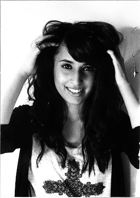
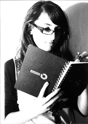
These are my portrait photos that i have taken. These photos are just experiments that came out really well which made me think i should use such photos in my final Light project. I took central portraits photo with the light shining on Christine, i then went into the Darkroom to make a negative photo and my photos came out with a scary look.


My Light Painting photos
My Light project with the IPAD

This is the photo i took from the camera which came out really well. The photo had different muti-colours on there which made the photo come out really good. The potential of this photo is the colours that has been presented. The photo has been taken with a black background and the different colour lighting from the iPad makes the photo look more effective. The limitation of this photo is that the photo is blurry. However, this may be because we had to take a photo in the dark and because it was dark we couldn't see if the photo is in focus or out of focus. As i went onto photoshop i recreated my photo to make the brightness of the iPad colours more brighter. This is presented in the second photo.
Rochons work has inspired me because it has given us ideas of which different types of lighting that can be used and how you may and can use them.
I would like to take this photo more further by using it for my final piece but ensuring that the photo would be in focus.
Subscribe to:
Comments (Atom)

.jpg)


